Next, I have created, designed and produced a outline made out of paper/card to show the basic model of the digipak.
Below shows a slideshow to show what the digipak consists of. This is a front cover, a inductory cover, a cover for the CD to be held, and finally the back of the cover. This means that we will need a number of photographs to choose from in order for our decision to be the best and most appropriate for the CD cover.

Wednesday, 8 February 2012

Research to Ancillary Task
As a group, we have investigated and researched the brief.
We have decided that we want to make a CD package and a magazine advertisement in order to relate and link to the main music video.
1. A promotion package for the release of an album, to include a music promo video, together with two of the following three options:
- a website homepage for the band;
- a cover for its release as part of the digipak (CD/DVD package);
- a magazine advertisement for the digipak (CD/DVD package).
Monday, 6 February 2012
Research to One Republic Ancillary Task
The next album I decided to analyse and research was "One Republic-Dreaming Out Loud." I decided to choose this album for research as not only did it relate to the target audience of our music video, but also One Republic was one of our music choices at the start of the coursework.

Looking at the CD cover for One Republics Album of "Dreaming out Loud," there is a vivid imagination for the colours and aspects used on the cover to describe both the band and their music. The album itself was released in America in November 2007 and the UK in March 2008.
The band became popular due to MySpace, MTV and other online commercials. The cover itself is full of effects and dark but mystifying colouring to illustrate the mystery behind some of the songs that have not been leaked or listened to before the album is produced. The glowing effect that has also been added the cover symbolises the title of "Dreaming Out Loud" which the mystifying aspect originates from, as it relates well. This is a key factor to consider as with our music video, it is about losing a important person in your/their lives, so relating the cover to the music video title is very important and has given me some ideas to introduce to the group for desiging next.

Looking at the back of the CD cover, I feel a contrast of colours has been used since the front of the CD cover. This is because the front has changed from a glowing blue effect to a mix of brown, beige and black to illustrate a photograph of the band. Having a photograph of the band or singers makes the CD in my opinion. This is because I feel that the customer(s) or user would want to know what the band looks like to have a image of them whilst listening to their music if they are for the first time. The bands mise-en-scene also sets the trends and target audience for their sellers which is a important factor to add.

The CD itself is quite plain and bland. This is because the main primary colour is white with a few smudge effects of grey, filled with black writing to illustrate the title and band of the CD and other information. I like the fact that the CD has writing all around the outer edge of the CD. This is because it gives it a vivid and unique edge to the CD, and iot is much needed after the plain background and colour choice!!!!
If i was to muddle up all the Cd cover, back panel and the CD itself, I do not think I would be able to match them all up. This is because different colour schemes, styles and effects have been placed onto each design making it impossible to tell they relate. This is a technique to learn for when we start to create or design the CD.
Looking at the CD cover for One Republics Album of "Dreaming out Loud," there is a vivid imagination for the colours and aspects used on the cover to describe both the band and their music. The album itself was released in America in November 2007 and the UK in March 2008.
The band became popular due to MySpace, MTV and other online commercials. The cover itself is full of effects and dark but mystifying colouring to illustrate the mystery behind some of the songs that have not been leaked or listened to before the album is produced. The glowing effect that has also been added the cover symbolises the title of "Dreaming Out Loud" which the mystifying aspect originates from, as it relates well. This is a key factor to consider as with our music video, it is about losing a important person in your/their lives, so relating the cover to the music video title is very important and has given me some ideas to introduce to the group for desiging next.

Looking at the back of the CD cover, I feel a contrast of colours has been used since the front of the CD cover. This is because the front has changed from a glowing blue effect to a mix of brown, beige and black to illustrate a photograph of the band. Having a photograph of the band or singers makes the CD in my opinion. This is because I feel that the customer(s) or user would want to know what the band looks like to have a image of them whilst listening to their music if they are for the first time. The bands mise-en-scene also sets the trends and target audience for their sellers which is a important factor to add.

The CD itself is quite plain and bland. This is because the main primary colour is white with a few smudge effects of grey, filled with black writing to illustrate the title and band of the CD and other information. I like the fact that the CD has writing all around the outer edge of the CD. This is because it gives it a vivid and unique edge to the CD, and iot is much needed after the plain background and colour choice!!!!
If i was to muddle up all the Cd cover, back panel and the CD itself, I do not think I would be able to match them all up. This is because different colour schemes, styles and effects have been placed onto each design making it impossible to tell they relate. This is a technique to learn for when we start to create or design the CD.
Research to Florence and the Machine Ancillary Task
I decided to get started on the research into different music covers which represented and were sold professionally in stores. I began by looking for music which related to our target audience for our music video. My first album I came across was "Florence and the Machine-Lungs." This album managed to reach number 1 in the UK and number 6 in America.

Looking at the album cover itself, it represents a large amount of emotions. Florence herself varies her music towards the Indie and Alternative look and style, which is much a like the target audience we are looking for.
Florence describes her music as the following: ''at best a kind of magic that lifts you up and takes you somewhere else'' and states that she writes her best stuff, ''when drunk or hungover!''
The album represents a innocent beauty within the CD, and as you can see the image has been portrayed. The use of colours is a little abstract but adds a lot of creation to the design itself. The CD cover itself is set with a thick black border to encourage the image to stand out, and I think this succeeds empowerment. The writing used on the CD also shows a innocent type look, with the curly and wavy writing for "Florence and the Machine" but a bold and outstanding words in capitals to emphasise the title of the CD. However, I do not think the correct choice of colouring for the text was appropriate for the word "lungs" as I feel that it doesn't stand out as much as it should, as well as it being placed on a white or light background. The mise-en-scene of this CD cover displays Florence as a middle length shot and is wearing light/white clothing to portray and carry on this innocent type look. A bold photograph has been photoshop'ed into the photograph to display the meaning behind the name of the CD, showing the reality of what is meant. Florence's eyes are shut and her face shows a elegant yet subtle look which I feel is a good effect for the CD cover itself.

Looking at the CD itself which was placed in the CD cover, the colour is abnormal and abstract as it is the mix between yellow and orange. The mise-en-scene displayed hands clutching something tightly, but it is unclear as to what exactly he/she is holding. However, my theory is that she is holding lungs to portray and relate to the CD cover and title. A effect has been placed onto the CD itself to show passion and in order to make the hands stand out and give a shadow or complexion for the CD. The use of the colour and font style for the title of the CD of ''Lungs'' is the same as what was placed on the front of the CD to begin with. This is the bold white font where there are two lines both above and below the word. This corresponds the effect throughout the digipak and this is a large fact to consider when I begin to create my album for "Alex Beckett" for my rough cut.

Finally, there is a back of the CD and this also relates to the CD itself. Looking at the colour scheme, compared to both the front cover and the CD for inside itself, the colour scheme has contrasted and instead of abstract and different use of colours, the back of the CD is just plain black and kind of dramatic. This colour scheme does not relate to the rest of the CD, but if they were to be mixed up, you would still be able to tell this back cover related to Florence and the Machines CD. This is because there is a large and annotated picture of lungs filling up the top half of the CD cover. By adding this, it makes the album correspond and link all the covers together.
Looking at the above slideshow, it shows some advertisements that Florence And the Machine and the production team have been creating, producing and manufacturing in order to advertise the album.
If I was to mix up all of the images including the CD cover, the CD itself and back version of the CD and take away the title of the album, I think I would definitely be able to tell that these were from the same artist or album. This is because they all portray and relate to each other, and although the colour scheme varies throughout, it is still easily conceived that they are from the same CD and artist.
Looking at the album cover itself, it represents a large amount of emotions. Florence herself varies her music towards the Indie and Alternative look and style, which is much a like the target audience we are looking for.
Florence describes her music as the following: ''at best a kind of magic that lifts you up and takes you somewhere else'' and states that she writes her best stuff, ''when drunk or hungover!''
The album represents a innocent beauty within the CD, and as you can see the image has been portrayed. The use of colours is a little abstract but adds a lot of creation to the design itself. The CD cover itself is set with a thick black border to encourage the image to stand out, and I think this succeeds empowerment. The writing used on the CD also shows a innocent type look, with the curly and wavy writing for "Florence and the Machine" but a bold and outstanding words in capitals to emphasise the title of the CD. However, I do not think the correct choice of colouring for the text was appropriate for the word "lungs" as I feel that it doesn't stand out as much as it should, as well as it being placed on a white or light background. The mise-en-scene of this CD cover displays Florence as a middle length shot and is wearing light/white clothing to portray and carry on this innocent type look. A bold photograph has been photoshop'ed into the photograph to display the meaning behind the name of the CD, showing the reality of what is meant. Florence's eyes are shut and her face shows a elegant yet subtle look which I feel is a good effect for the CD cover itself.

Looking at the CD itself which was placed in the CD cover, the colour is abnormal and abstract as it is the mix between yellow and orange. The mise-en-scene displayed hands clutching something tightly, but it is unclear as to what exactly he/she is holding. However, my theory is that she is holding lungs to portray and relate to the CD cover and title. A effect has been placed onto the CD itself to show passion and in order to make the hands stand out and give a shadow or complexion for the CD. The use of the colour and font style for the title of the CD of ''Lungs'' is the same as what was placed on the front of the CD to begin with. This is the bold white font where there are two lines both above and below the word. This corresponds the effect throughout the digipak and this is a large fact to consider when I begin to create my album for "Alex Beckett" for my rough cut.

Finally, there is a back of the CD and this also relates to the CD itself. Looking at the colour scheme, compared to both the front cover and the CD for inside itself, the colour scheme has contrasted and instead of abstract and different use of colours, the back of the CD is just plain black and kind of dramatic. This colour scheme does not relate to the rest of the CD, but if they were to be mixed up, you would still be able to tell this back cover related to Florence and the Machines CD. This is because there is a large and annotated picture of lungs filling up the top half of the CD cover. By adding this, it makes the album correspond and link all the covers together.
Looking at the above slideshow, it shows some advertisements that Florence And the Machine and the production team have been creating, producing and manufacturing in order to advertise the album.
If I was to mix up all of the images including the CD cover, the CD itself and back version of the CD and take away the title of the album, I think I would definitely be able to tell that these were from the same artist or album. This is because they all portray and relate to each other, and although the colour scheme varies throughout, it is still easily conceived that they are from the same CD and artist.
Feedback on our Rough Cut
Once the rough cuts were uploaded onto each of our blogs , we all got together as a class and showed our videos in order to give and receive feedback in order to help improve our music videos.

Feedback 1
- Good opening timings, match in the beat with the song.
- Female keeps laughing and takes away the seriousness of it.
- Some shots do not match with beat.
- When he is standing still he moves slightly too fast as members of public slightly wobble.
- Too dark at the end.
Feedback 2
- Boy seems to be wearing different clothes in some parts.
- Good use of lighting in the beginning.
- Spend too much time on certain shots.
- Lighting towards end of video too dark.
Feedback 3
- Actress smiles at times.
- Nice dimmed effect in bedroom (sepia)
- Cannot see photograph on phone properly.
- Story is easily told.
- More closeups of actor and actress needed.
- Some bits too dark.
Feedback 4
- Girl laughing in argument.
- Like the shot in the graffiti scene!
- Need more close ups of him singing.
- Car scene should be shortened.
Feedback 5
- Pace of editing needs to increase during chorus.
- Fades and dissolves needed especially in verses.
- Camera is too dark at end.
- Needs a final shot.
Feedback 6
- Too many long shots-more close ups needed.
- Dark scenes.
- Timing issues.
Feedback 7
- Some shots are repeated a little, need more footage.
- Some shots need to be clearer.
Feedback 8
- Need less shots from back of body.
- Need more singing/miming parts.
- Sped up doesn't work.
- Too dark at the end.


Feedback 1
- Good opening timings, match in the beat with the song.
- Female keeps laughing and takes away the seriousness of it.
- Some shots do not match with beat.
- When he is standing still he moves slightly too fast as members of public slightly wobble.
- Too dark at the end.
Feedback 2
- Boy seems to be wearing different clothes in some parts.
- Good use of lighting in the beginning.
- Spend too much time on certain shots.
- Lighting towards end of video too dark.
Feedback 3
- Actress smiles at times.
- Nice dimmed effect in bedroom (sepia)
- Cannot see photograph on phone properly.
- Story is easily told.
- More closeups of actor and actress needed.
- Some bits too dark.
Feedback 4
- Girl laughing in argument.
- Like the shot in the graffiti scene!
- Need more close ups of him singing.
- Car scene should be shortened.
Feedback 5
- Pace of editing needs to increase during chorus.
- Fades and dissolves needed especially in verses.
- Camera is too dark at end.
- Needs a final shot.
Feedback 6
- Too many long shots-more close ups needed.
- Dark scenes.
- Timing issues.
Feedback 7
- Some shots are repeated a little, need more footage.
- Some shots need to be clearer.
Feedback 8
- Need less shots from back of body.
- Need more singing/miming parts.
- Sped up doesn't work.
- Too dark at the end.


Thursday, 2 February 2012
Wednesday, 1 February 2012
Editing
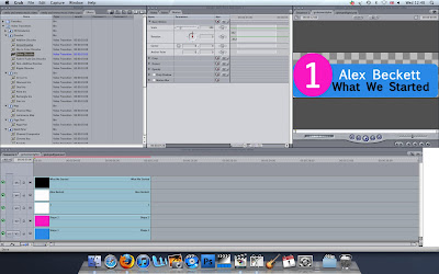
Once we got the filming we thought we needed, it was time to use "Final Cut Express HD" This meant it was time to edit.....
The editing took us a long period of time and meant we kept having to go out to re-film parts we didn't like or bits we missed out by accident. However, by 31st January 2012, the editing for the rough cut was completed.


The editing took us a long period of time and meant we kept having to go out to re-film parts we didn't like or bits we missed out by accident. However, by 31st January 2012, the editing for the rough cut was completed.

Subscribe to:
Posts (Atom)