Showing posts with label Research. Show all posts

Monday, 27 February 2012

Research Of Magazine Advertisements

I have been researching into different magazine advertisements for our second part of the ancillary tasks. Magazine articles that advertise either the band or a CD or song they released are very hard to find online. However, I have come across a few ideas.

Firstly, I came across the "Sound and Vision" magazine advertisement. I feel that this relates to the "Blur" album cover I researched earlier. The choice of colours and several photographs explains a story and the colours could identify moods and emotions that are portrayed, which would relate to the music video. This is because we need something to relate so there will be a relation to the products as a whole. The font use and colours gives the poster a edge that is needed for this type of genre and target audience and has given me good ideas for creation and design of the digipak.

Although Jessie J does not fit in the genre or target audience we are looking for completely, the use of her magazine article shows a powerful and a strong confidence side to herself. The use of colours mostly portray black with a bold gold writing and title to embrace the title of the show to make it stand out, which has worked perfectly. The use of a closeup of her face makes the emotions stand out and attract the fan or customer into purchasing the product. The strong colour scheme is helping to give us a few ideas for when we design our digipak.

Research of Digipak

Below, I have researched and found other bands or singers that relate to the target audience and genre we used, and have found different ways bands have portrayed their album.

Firstly, I have found this album from "Blur." This is a unique type of album cover and I had ideas for some like this. The fact the album is split into four with the title in the middle gives the CD a unique appeal, that is differentiated in the market. However, if I was to do something like this for our music video, I feel it would not be cartooned and it could show both of the actors and two location shots maybe. This would work and I feel it would be different to the others out in the market at the moment. The use of the word "Blur" seems plain and all in lower cases, showing the focus is mainly on the photograph/background rather than the text. The only complication I would have with this would be that I need to add a title of the album but unsure about where this may go.

The image above has not been used on a CD but I think that it could give us a idea about the CD cover or a page inside. As the story focuses on both the male and female character in a relationship but shows both good and bad memories before she died, this gives a insight to both emotions and figures displayed. I have not come across a CD cover that looks like the one above before so this may be a good time in order to separate myself from the current music market in order to make the CD stand out.

The "Foo Fighters" album was another that I came across while researching album covers and CD's. This is because this album is simple yet colourful as you can see face's that colours have been exploited in order for them to stand out on the cover. The bold choice of red, pink, green and blue on a black ground shows that the colours stand out. This could also be said to relate to the title of the album "Wasting Light." This is because there is no light used in black, but contrasts with the bold use of the colouring of the faces. We could use this design and idea for ours as we have lots of close ups in order to show emotions, that we could use to put onto our final design of the CD cover.

The final CD cover I found was "Alanis." To me, this CD cover stood out from the rest when I was researching as I could see our actors in place of this female actor, in order to make our CD cover represent the music video and the other ancillary product we will make. I feel that using a overlay and changing the opacity of another image on top of the main image gives a sense of emotion and feeling, and this could represent our video appropriately. However, I feel that the choice of colour of the yellow could be changed to a blue or black and white in order for the image to shed more emotion. The use of font on this album is good but cannot be seen from far away due to the colour choices and this is a key factor we will be looking for when designing and producing our CD cover for "Alex Lloyd."

Wednesday, 8 February 2012

Researching into Advertisments

Another aspect of our ancillary tasks is not only to create a digipak for our music video, but also to create a poster of advertisement to advertise the music video.
I have annotated and shown aspects of the digipaks for both Florence and the Machine and One Republic, so I decided to take it one step further and use them again to view and annotate their advertisements like the posters that represent both themselves and their albums.

Florence+the Machine
Firstly, I have been researching for Florence and the Machine's posters to advertise both herself and her album in order to get more purchases sold or more concert ticket purchases.

If you take a look at both advertisements from Florence + the machine, you can see the same effect has been added and the same photograph has been used for both the album advertisements and the concert. This shows the artist has a specific house style she uses throughout her work so that customers and fans will not get confused and misplaced. This photograph is actually the same as what is used on all her merchandise and the CD itself. This means that all her belongings and merchandise all relate and suit each other which means it would be able t o tell her things from everyone elses if mixed up which is a good factor to have. From this, I have gained experience and skills into what I am going to be looking for and designing when designing and producing my advertisement of a poster shortly.

One Republic

Looking at both the advertisements I found for "One Republic" I can see both have exactly the same designs, comparing this to Florence and the Machine. This means that both images match so the customers and fans are able to tell who the poster or advertisement refers to. This is a key factor when thinking about creating and design our own music cover.

Design for the Digipak

Next, I have created, designed and produced a outline made out of paper/card to show the basic model of the digipak.
Below shows a slideshow to show what the digipak consists of. This is a front cover, a inductory cover, a cover for the CD to be held, and finally the back of the cover. This means that we will need a number of photographs to choose from in order for our decision to be the best and most appropriate for the CD cover.

Research to Ancillary Task

As a group, we have investigated and researched the brief.

1. A promotion package for the release of an album, to include a music promo video, together with two of the following three options:

  • a website homepage for the band;
  • a cover for its release as part of the digipak (CD/DVD package);
  • a magazine advertisement for the digipak (CD/DVD package).
We have decided that we want to make a CD package and a magazine advertisement in order to relate and link to the main music video.

Monday, 6 February 2012

Research to One Republic Ancillary Task

The next album I decided to analyse and research was "One Republic-Dreaming Out Loud." I decided to choose this album for research as not only did it relate to the target audience of our music video, but also One Republic was one of our music choices at the start of the coursework.

Looking at the CD cover for One Republics Album of "Dreaming out Loud," there is a vivid imagination for the colours and aspects used on the cover to describe both the band and their music. The album itself was released in America in November 2007 and the UK in March 2008.
The band became popular due to MySpace, MTV and other online commercials. The cover itself is full of effects and dark but mystifying colouring to illustrate the mystery behind some of the songs that have not been leaked or listened to before the album is produced. The glowing effect that has also been added the cover symbolises the title of "Dreaming Out Loud" which the mystifying aspect originates from, as it relates well. This is a key factor to consider as with our music video, it is about losing a important person in your/their lives, so relating the cover to the music video title is very important and has given me some ideas to introduce to the group for desiging next.

Looking at the back of the CD cover, I feel a contrast of colours has been used since the front of the CD cover. This is because the front has changed from a glowing blue effect to a mix of brown, beige and black to illustrate a photograph of the band. Having a photograph of the band or singers makes the CD in my opinion. This is because I feel that the customer(s) or user would want to know what the band looks like to have a image of them whilst listening to their music if they are for the first time. The bands mise-en-scene also sets the trends and target audience for their sellers which is a important factor to add.


The CD itself is quite plain and bland. This is because the main primary colour is white with a few smudge effects of grey, filled with black writing to illustrate the title and band of the CD and other information. I like the fact that the CD has writing all around the outer edge of the CD. This is because it gives it a vivid and unique edge to the CD, and iot is much needed after the plain background and colour choice!!!!
If i was to muddle up all the Cd cover, back panel and the CD itself, I do not think I would be able to match them all up. This is because different colour schemes, styles and effects have been placed onto each design making it impossible to tell they relate. This is a technique to learn for when we start to create or design the CD.

Research to Florence and the Machine Ancillary Task

I decided to get started on the research into different music covers which represented and were sold professionally in stores. I began by looking for music which related to our target audience for our music video. My first album I came across was "Florence and the Machine-Lungs." This album managed to reach number 1 in the UK and number 6 in America.

Looking at the album cover itself, it represents a large amount of emotions. Florence herself varies her music towards the Indie and Alternative look and style, which is much a like the target audience we are looking for.
Florence describes her music as the following: ''at best a kind of magic that lifts you up and takes you somewhere else'' and states that she writes her best stuff, ''when drunk or hungover!''
The album represents a innocent beauty within the CD, and as you can see the image has been portrayed. The use of colours is a little abstract but adds a lot of creation to the design itself. The CD cover itself is set with a thick black border to encourage the image to stand out, and I think this succeeds empowerment. The writing used on the CD also shows a innocent type look, with the curly and wavy writing for "Florence and the Machine" but a bold and outstanding words in capitals to emphasise the title of the CD. However, I do not think the correct choice of colouring for the text was appropriate for the word "lungs" as I feel that it doesn't stand out as much as it should, as well as it being placed on a white or light background. The mise-en-scene of this CD cover displays Florence as a middle length shot and is wearing light/white clothing to portray and carry on this innocent type look. A bold photograph has been photoshop'ed into the photograph to display the meaning behind the name of the CD, showing the reality of what is meant. Florence's eyes are shut and her face shows a elegant yet subtle look which I feel is a good effect for the CD cover itself.

Looking at the CD itself which was placed in the CD cover, the colour is abnormal and abstract as it is the mix between yellow and orange. The mise-en-scene displayed hands clutching something tightly, but it is unclear as to what exactly he/she is holding. However, my theory is that she is holding lungs to portray and relate to the CD cover and title. A effect has been placed onto the CD itself to show passion and in order to make the hands stand out and give a shadow or complexion for the CD. The use of the colour and font style for the title of the CD of ''Lungs'' is the same as what was placed on the front of the CD to begin with. This is the bold white font where there are two lines both above and below the word. This corresponds the effect throughout the digipak and this is a large fact to consider when I begin to create my album for "Alex Beckett" for my rough cut.

Finally, there is a back of the CD and this also relates to the CD itself. Looking at the colour scheme, compared to both the front cover and the CD for inside itself, the colour scheme has contrasted and instead of abstract and different use of colours, the back of the CD is just plain black and kind of dramatic. This colour scheme does not relate to the rest of the CD, but if they were to be mixed up, you would still be able to tell this back cover related to Florence and the Machines CD. This is because there is a large and annotated picture of lungs filling up the top half of the CD cover. By adding this, it makes the album correspond and link all the covers together.


Looking at the above slideshow, it shows some advertisements that Florence And the Machine and the production team have been creating, producing and manufacturing in order to advertise the album.
If I was to mix up all of the images including the CD cover, the CD itself and back version of the CD and take away the title of the album, I think I would definitely be able to tell that these were from the same artist or album. This is because they all portray and relate to each other, and although the colour scheme varies throughout, it is still easily conceived that they are from the same CD and artist.

Thursday, 8 December 2011

Techniques and Ideas

We looked on YouTube and found the video "Thou shall not kill" by "Dan Le Sac" to look for examples of the techniques we want to use on our music video.

The first example we found was cutting so that the person comes closer to the camera. We decided that we would use this technique a that end of the video to show the male character running towards the camera as he goes to the girlfriends house.


The next example would be that this shows the slide of the male character fading down the stairs. We are hoping to create this in our music video to give the effect of the male character going down the stairs.

Thursday, 1 December 2011

Possible Main Characters

Looking through possible characters we could use for the music video, we have annotated them to their genre. We are looking for someone to show good characterisation with good dramatic skills which will enable him to laugh, smile, cry, upset and be angry. This involves a lot of work in order for the music video to look good and realistic, so we decided to narrow it down to 4 people we could use, before choosing the final male character. Below, shows 4 main people we have chosen to take part in the video, but we need to choose ONE.

Male Characters
The first person displayed on the slide show is Charlie. We decided he could be a possible feature to be used as the main character as not only does his dress sense fit the brief we are looking for, but he can make all the filming times and sets possible when we need him. This is a large advantage and we think he will be a good candidate. Looking at the clothes that Charlie is currently wearing in the photograph, we feel that this could be one of the possible clothing outfits we will ask him to wear for part of the filming. The only problem with Charlie is that he has not tried to create or produce a music video beforehand, but other than that we feel that Charlie is a suitable and a strong candidate to use for our filming for our music video.


The second person we asked was Sam. Sam also fits the brief and we are keen for him to take the part. This is because he has done drama in previous years so we feel he will be good for the dramatic skills and techniques that we are looking for. The look of Sam that is shown in the photograph shows his dress sense and this could be one of the outfits we ask him to wear for the music video. Sam is also available for all the times and days we need him to film. Sam has the build and height that we are looking for, as well as the confidence to perform well in front of the camera when filming. This means that Sam will be a strong candidate for filming in our music video if he is chosen.


Thirdly, we have chosen Luke to be part of the search for our main male character. This is because he has a strong build which is the type we are looking for. He also has a fresh kind of look and fits in with the genre we are looking for. Luke is a good candidate but the only disadvantage would be that because of Luke's job, he may not be as flexible as the others with the filming hours, which could cause a inconvenience for when we need to film at London, as this would start from early in the morning to late at night to ensure we get all the daylight hours to film. Because of this, I feel it would be too much hard work and complicated times and days if we asked Luke to become our main character for filming, rather than someone that is flexible out of our other 3 candidates.


The final candidate we have chosen to look at is Josh. Josh said he is happy to be in the music video but can be quite shy at times, which we wonder will cause trouble when filming the happy memories between himself and a female actor. On the other hand, Josh is very flexible with times and has the dress sense that will help us move forward for the music video, as he fits the genre.However, with Josh being a shy character, we do not feel he would be suitable as he will not be as confident as the other candidates.


Female Characters
Megan is our first contender for a female character part. She is a close friend of both myself and Emma and we feel she would be good playing the part of the female character, or the ex-girlfriend. This is because we feel that she is able to shoot scenes within the music video that involve emotions like upset, hurt, anger and love. However, due to Megan's commitment issues towards her school work and her work, she is unable to film the times we need her to.


I have been chosen to be the second possibility for the female main character. This is because I will be available for filming. However, i do not think i would be able to perform the scenes well and because there are only myself and Emma in a group, i think it would be hard to make Emma do all of the filming alone, so I think we need to choose someone who is not involved within our group.


Final Animatic

This is our final version of the anamatic drawing, which we created using iMovie and edited the photographs using iPhoto. This animatic shows all of the shots and sets that we are going to use for the filming for the music video.


Wednesday, 16 November 2011

MoodBoard

Both myself and Emma created a mood board over 4 A3 pages of paper in order to work out our storyline, by adding photographs and writing to represent the locations, moods and feelings, as well as the characters and clothing/appearances involved within the mood board.
This helped us work out what we were going to create and set it clear the locations and people involved. It also gave us a proper insight to the story behind the filming in order for us to get the feeling for the video.

Above shows a development photograph of Emma and myself working on our mood board.

Monday, 14 November 2011

The Audience

Researching the audience, we have come up with the audience being selected into the "Trendies" category. Looking at the target audience and the genre selected, I can see that although the audience may be "Trendies" this also links onto different genres and styles including mainly the "Indie Scenesters" but also Young Alts, Geeks, Hipsters, Townies and Craft Kids. Each of the groups have a unique style and appearance and into differentiated brands and interests.


"Trendies were once an exclusive tribe, populated only by those with the access, knowledge and cash to spend on fashion."As can see, below shows the consumption of how much people of this genre watch and do things. The below diagram also shows the shops and brands they shop at and purchase, as well as the media they look at.

"It's all about vintage for trendies. One-off pieces from eBay or charity finds are key, combined with staples from Top-shop, H&M, Primark and Urban Outfitters, and designer goods which are increasingly pitched as realistic options for Trendies, like Acne, Luella, See by Chloe and Folk."
Below are two of my own photographs of friends who share the audience we are looking for. To the left is a photograph of my friend, Sam, who fits into the "Trendies" genre. On the right, is a photograph of my sister, Victoria, who fits in the "Rah" genre which links to "Trendies" and the genre we are working towards.

Monday, 3 October 2011

Editing in Music Videos

There is a real impact for editing music videos for three different matters:
  • It creates shape for the video
  • It reflects the music
  • It gives the video MEANING!
There are many ways in which we can edit a music video, by the use of transition shots, pace of editing, length of shots, place of shots (e.g close-ups) seeing who the main privileged of the video is, as well as many more.

Song Choice ONE.
PLEASE CLICK HERE TO LISTEN/VIEW THE SONG AND FULL VIDEO
I am going to find three videos to which I can view and analyse them to compare the editing process. My first video I am going to look at is "The Fray-How To Save A Life." I chose this because it is so well known to many generations with impact of both the video and lyrics, as they both have powerful meaning. The song also fits in my genre and I think gives out passion and emotion to viewers/listeners.

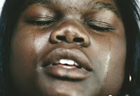
Throughout the whole video, there is excellent use of editing, with close ups, shallow focus, fast pace editing but also the video includes both narrative and performance based. The video is introduced from a fade from black transition shot, where the writing "How to save a life" moves horizontally across the screen in a glowed gray text, showing a blurred pianist, which gives confusion to the viewers, to wonder whats going to happen and what the video is going to be about.


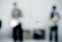
The camera then pans horizontally again to show the band (The Fray) still in blurred focus, extreme close up of the lips, to which zooms out before changing to show the lead singer, giving him privilege as he is the first person they see clearly. However this is a to see his face to show the emotion of the lyrics.



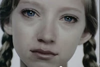
Writing, both computerised text and handwriting have been used to emphasize some of the words, for example "LISTEN" "DON'T BE SCARED"and "LET IT GO" followed by a few more. The whole video consists of many different people, mostly young, showing their pain and emotions in close up or medium shots. The pace of editing changes with the song, the chorus a bit faster than the verses. The expressions on the peoples faces are mainly upset, crying or have blank expressions, standing in front of a white background to show maybe hurt, pain, loss or confusion about something or someone in their lives. Zoom, fast pace editing and different closeup shots are shown within the narrative part of the video.


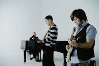
On the other hand is the performance side of the video. The editing is used fastly paced and different angles of the camera is used to influence the use of the music and the beat. There are many close ups of the instruments and the musicians faces, hands etc, but mainly the main character/singer gets most privilege. A focus pull is used frequently throughout the video to show each musician playing the instrument, where he is clearly seen and foregrounded, whereas the other two are in the background and blurred.


Whilst the lyrics "Where did I go wrong? I lost a friend, somewhere along in the bitterness" plays, the hurt, loss and depression expression are shown throughout both young children and young adults to show the emotion and passion of losing someone close or someone that means a lot to you, which makes the viewer sympathize.
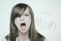

This video relates to my ideas for the music video, not only due to the genre, but also the storyline of missing someone, or people who have lost loved ones. In our group, we were thinking the lyrics related to missing someone special, with memories etc in the video, and I think that doing close ups and fast pace editing could be used.

Song Choice TWO.
PLEASE CLICK HERE TO LISTEN/VIEW THE SONG AND THE FULL VIDEO
The next song I have chosen to analyse whilst looking at the Editing of music videos, is "Hey There Delilah" by the "Plain White T's." This song also fits in with the genre of my chosen artist for my chosen song.

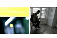
The editing in this video has given me inspiration for my video when thinking of ideas, as most the whole screen of the video is split into three boxes, with one half the screen showing the narrative side to the video and the other showing the performance side with the band. The video includes things like shot angles, zoom, close up shots, emotions and many different locations in order to get a good music video. I also feel the video stands out due to the screen being split into three.

The use of editing is powerful in the video, not only because of the third way split in the screen but due to the way two things are being shown in the screen as the same time. Constantly, one side of the screen shows the performance side, the band playing the instruments, singing etc whereas the other half of the screen shows the narrative side of the story, which gives the video a unique edge to it, and separates it from other videos in the music industry.


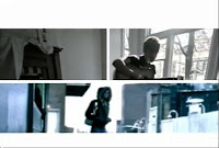
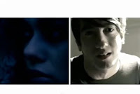
Another editing technique that has been used in this video is the use of Close-Ups. Close-Ups have been used throughout the video to show the pain and emotion of peoples faces, so the viewers and listeners can translate and sympathise. Also, the close up clips are mostly shown together when the screen is divided into two. (shown below.)

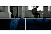
The lighting effect is key in the music video by the "Plain White T's." As you can tell from several screen-shots, a low key lighting effect has been used for the narrative side of the story, and this can be used to create a low or sad mood, making the viewers and listeners sympathise for the character and the story the lyrics are translating to us. On the other hand, the performance side of the screen is usually a little lighter, as they are sitting in a bright room with natural sunlight shining through, rather than artificial lighting.


This video gave me a idea for my chosen music video of Alex Lloyd-What We Started. The idea was that I could try and split the screen during the editing process to give two shots; one of the male character, and the other the woman character, to see both emotion, situations and the atmosphere. I feel this is a good idea and I will talk to my group member, Emma to see if this is a good enough idea to input this into the video.

Song Choice THREE.
PLEASE CLICK HERE TO LISTEN/VIEW THE SONG AND THE FULL VIDEO
My final song I have chosen to look at for editing purposes is "Oasis-Wonderwall." I chose this video as it is very well known and the editing used in this piece of music is very unique and different compared to others in the music industry. The whole video throughout the song is placed in Black and White effect, which can give out the signals that the song is going to be a a slow pace song with a unhappy mood to it.


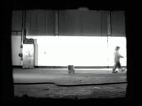
A very unique editing technique is also used right at the beginning of the video, at around 0.18 seconds into the video. This includes a Jump Cut but instead of the camera changing position of around 30 degrees, the camera stays straight and zooms in so the camera movement is continuous but jumps, so the narrative story still makes sense.

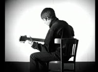
Fade transitions have also been used throughout the music video in order to change scenes, locations and shots throughout the 4:40 length of video. Fade transition shots are a good way to change scene as the current shot will fade and the new shot will look less transparent until the past shot cannot be seen anymore.


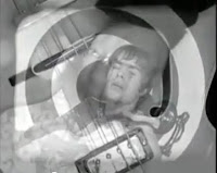
Another way of editing that has been used in the "Wonderwall" music video by "Oasis" is the way that the whole video is shown in Black and White, but effects have been added so that some of the objects throughout the video are in blue/colour, rather than black and white.
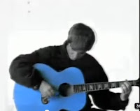


I got ideas from this music video to change the colour to black and white for parts and to change some of the things in the video to coloured. This could be done and used in my music video for some parts, or the other way round where the whole video is colourful with a few things in black and white to give the effect.