Monday, 12 March 2012

Evaluation Question 4


4. How did you use media technologies in the construction and research, planning and evaluation stages?

Here, I am going to list all the use of technologies that I have used throughout the A2 Media coursework which helped interact the user:

 Cannon Camera
 This was the main piece of equipment that we used for the making of both our rough and final cut as to the left is the "Cannon Video Camera" which we used. Without this technology, we would have a poor quality filming meaning that the story would be unclear and you would not be able to see the artist miming or singing the song in the video. This helped us in the production and to enable us to film without any problems.


Final Cut Express HD
We used Final Cut Express HD in order to edit and finish off both the rough and final cut, by adding in the effects and the transition shots to complete the music video. This program allowed us to drop in parts of the music video to drag into the time line to get it into the right place for the song so that the timing was correct and to give it the effect I was looking for. Without this program, editting would not be done and the video would look poor, especially as myself and Emma used many transition shots and effects for our music video. Also, we would not have been able to use Movie Maker  as it has a audio track limit meaning it would not be possible to edit and upload th video.

 Blogger
Blogger was the biggest part of the coursework. This is because Blogger was the blogging website to which all my coursework was stored onto. Blogger has many advantages as it means that I did not have to have a folder with all my coursework in as this would be large, and also the videos, slideshows and other uses of ICT would not have been able to print them out working properly.

 iPhone 4S
As you can see, we used an Iphone 4S for some of the equipment for our coursework. This indeed was my phone to which we used to take the photographs for the digipak and for the music advertisement. We decided to use an iPhone rather than a camera as we felt it held more megapixels and it would be easier to transfer the photographs to the computer via email rather than finding and sorting out the necessary leads in order to do this process.


Tripod
We used a tripod so that we could balance the camera nicely on top of the tripod whilst filming. This meant that we were able to give a straight edge whilst filming and meant that the filming would not be bumpy or at different heights, so the filming looked more professional and realistic. Without the use of the tripod, this would not be possible and the filming would look bad as hands are shaky and this would ruin the film/music video as a whole.
MPEG Streamclip
MPEG Streamclip was used for the various stages of the conversion from final cut to vimeo, to which we then were able to upload to our blog to ensure that the videos were clear. This is because if the video was uploaded straight tot he blog, the video looks fuzzy and unclear for the viewer, meaning it would be hard to see or watch the video, so without this software, the video would not look realistic or professional. FRom this program, we were able to convert the videos from Final Cut and export it to Quick Time Conversion, to then open it up on MPEG to export again to a .MOV.
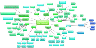
Bubbl
I used the Bubbl program located and found on the Internet in order to create a spider diagram. This helped me with the planning and research as it allowed me to think about the clothing, atmosphere, settings and the memories, to go back to explain these ideas with Emma. Without this, we would have had to use paper meaning that the ideas would get lost and it would be hard to read, meaning that this was the best way in order for it to look realistic and professional.


Abode Photoshop CS4
Photoshop has been used throughout these last 2 years enormously for different tasks and briefs. For this year, Photoshop helped me by helping to edit photographs, adding text to the music video and to help us effect and edit the photographs for the digipak in order for us to create the same house style and consistancy, as well as with the help with iPhoto.


YouTube
YouTube was a great help with the research and planning stages for our coursework. By using YouTube, we were able to help find out about exsisting music videos and gave us ideas and thoughts for our storyline. YouTube also found us or song by Alex Lloyd. Without the use of YouTube, we would not have been able to find our song for the final cut meaning the coursework/video would not have been possible in the first place.


Vimeo
Vimeo was a key use of a program for the uploading of our final cut. This is because without Vimeo, we would have the basic uploader for Blogger, meaning that our music video would appear all fuzzy and unclear, meaning it would be hard to watch for the user/viewer, making the storyline unclear and makking the mining or singing of the artist also unclear, bringing an disadvantage to the whole of my coursework.


FireFox Internet
The Internet I used for the research, planning and for blogging purposes was Fire Fox. I decided against using Safari as I felt that the programs loaded slower and some websites blocked photographs on the Internet and specific programs. Without FireFox, I do not feel that I would have total access to the programs and photographs I wanted and needed to reach.


SoundCloud
For Evaluation Question 1, I created and edited this question myself. I used the use of Sound Cloud from my iPhone 4S. Sound Cloud allowed me to record both myself and Emma's voices in order to talk about the conventions and to give an audio soundover, to interact with the user and viewer more throughourly. Without the use of Sound Cloud, i would not be able to record the voices easily and clearly, and it would be harder to transport the sound clips from my phone to the computer, making the process harder to complete.

iPhoto
I used iPhoto on the Apple Mac's at school in order to create and develop the images for the digipak and for the music advertisement for Alex Lloyd. The effects from iPhoto meant that the saturation, effect and colouring were slightly black and white, creating the house style and the effects we were looking for. This meant that the consistancy that we created throughout is effective and professional.


Facebook
Facebook was a good aspect to use for my Media Coursework, espeically for the Feedback section and for the Evaluation Questions. Social networking sites like Facebook were used to ask my friends for feedback on my final cut video which creates another form of feedback for different varieties of platforms.Facebook was also used throughout the coursework for my A2 media as I used the social networking site to ask opinions from friends and family for different photographs, the digipak and the music advertisements, so I can see the different points of views in order to see what I could improve or work on to make the final products more effective and professional.


Grab Tool
I used the Grab Tool in order to take screen shots of different images, programs and applications in order to show my progress throughout the unit of coursework in creating all of the final products. A Grab tool was used rather than just clicking on the print screen button on the keyboard because on Apple Mac's, this button was not available so the Grab Tool, so this program was the only other optional program.


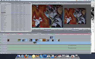
Screenshot of the use of Final Cut
To the left shows the use of Final Cut Express HD. Using the Grab tool I have taken a screen shot of myself using Final Cut to edit the Final Product for our music video. As you can see, the program shows the use of editing and cutting up our filming into parts so that the music video makes sense. With the use of the transition shots and the effects, it means that the music video will look more creative, inventive and professional in order for it to look like a realistic version of a music video.
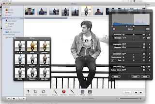

Screenshot of the use of iPhoto
The screenshot of the program "iPhoto" shows the manipulation of the photographs for both the digipak including the CD cover, back cover, middle sections and the actual CD, as well as the music advertisement so that there is a consistency and a house style throughout the whole of the final products.

Evaluation Question 3

3. What have you learned from your audience feedback?


After receiving our first set of feedback for our rough cut, we reliased that gaining feedback from other members of the class was  a brilliant idea as it meant that we could hear from other peoples points of views in order to improve on things we did not think about beforehand. Because of this, we knew that at the end, when all the final cuts were due in, the next step was to see what the whole year that is doing A2 Media thought of everyone else's video's to see their thoughts and feelings towards everyones videos.


 Our first step to getting feedback from our final cut was on the 13th March 2012, where everyone in my year of A2 Media could come along and watch everyone's videos in order to give them feedback on their tasks to see if there was any problems with the filming or storyline which could be improved, and below are some photographs to show this:


The next step we undertook was creating a questionnaire to which we handed out to a few (10) of our friends to enable them to answer the questions about what they thought of our music video and ancillary tasks as a whole. The questions included:

1. Did you find the story for the music video clear and easy to understand?
YES- 10
NO- 0
2. Do the products and video link together?
YES- 10
NO- 0
3. Do the products link to the Indie Genre?
YES- 10
NO- 0
What would you rate the video and the products out of 10?
7/10- 4
8/10- 5
9/10- 1
What do you think was the best part of the video?
Memories- 2
Ending- 7
Storyline- 1

Waas the final cut better than the rough cut?
YES- 10
NO- 0

The next step to gain our audience feedback from our products and video, we went onto our social networking websites and shared the video on there. This then enabled us to gain information and comments about what our friends and family thought of the video that was linked to our Facebook.


We then text a few of our friends to ask them to write on the social networking site to help us gain the feedback.

Our last step of the feedback process we went through was to record our friends to see their comments of the video, CD digipak and the music advertisement. Below shows the video we created using Final Cut.

feedback from emma maher on Vimeo.

Evaluation Question 2

2. How effective is the combination of your main product and ancillary texts?


As you can see via the slideshow below, the consistancy between all covers for the CD digipak is constant throughout the CD and this carries on to the music advertisement poster.
The use of editing combined onto the digipak enables the cover and documents share uniqueness and combines the project together through things like; colour scheme, font styles, imagery and linking the digipak to our target audience. Referring back to my post published on 14th November (14/11/11) I researched and developed the meaning of our target audience; "The Indie Scenesters." This combined the different genres including; Trendies, Townies, Hipsters, Craft Kids, Geeks and Young Alternatives. We researched  furthur into this to find their likes and dislikes, and found that this target audience is what we are looking for. I also remember my AS level magazine had the same target audience, which was key as it meant I already knew the types of clothes style and things they were into which helped build the genre stereotype of a "Indie Scenester."
The main product links to the ancillary task gratefully as you can tell by the ancillary task photographs that both myself and Emma took at Thamesmead, in order to get the effect we were looking for. The digipak was taken in the same place to which some of the filming occured, in front of a railing in Thamesmead, where the background was the Thames River.
This created a lovely background effect for both the filiming and the digipak and combined, created a great consistancy between them both, and linked the main product and ancillary task together. If the viewer was to look at the CD digipak before viewing the main product of the music video, they should be able to distiguish both the target audience and the type of emotions that the artist is portraying throughout the ancillary task. The use of positionning towards the camera and the movements that took place enable a sad kind of emotion and the title "What We Started" links in with a breakup or something that happened which he is looking back on memories. This is why we named the album "What We Started" so that it would link more to the final product. The photographs used on the CD cover link to the narrative music video as it shows scenes and screen shots of the video. The video itself is a narrative music video as we found the lyrics to the song linked more to a relationship based video rather than a performance video. However, when we created our rough cut, we based it upon a relationship break up but this storyline slightly confused the viewers from our feedback. This is why we decided to go slightly more drastic and create the feeling of loss when the viewer reliases the death of the girlfriend. This then gives a clear story line as the music video is based around memories of both good times and arguements that the couples had, before the realisation that she is actually dead. The feedback we recieved on this story line was great as it meant that the users understood the story behind the lyrics and also added comments like they fit the lyrics and the movement of the song written and performed by Alex Lloyd. The feeling of loss and lonliness transforms and transpires throughout the CD digipak as well as the music advertisement poster we created. This is because the use of effects and the black and white saturation enables a memorable mood, contrasting with a bold and brightly coloured CD which would be used to emphasise a happy or positive music. The colourless effect relates and relys on the consistancy that transforms through the CD and gives out the emotions I was looking for.

By editing and changing the effects of the; Levels, Contrast and Brightness, Saturation and Sharpeness, it gave the emotion packed and colourless CD cover we were looking and hoping for. This cover could also be seen as to wonder to the viewer what the CD is about and may intrigue the user into picking up the CD to view the song tracklist if the digipak was to be sold in a exsisting music market today.


The clothing shown and worn in both the final and ancillary tasks are exactly the same. This relates and combines them both and links the user to the final product if the CD or music video was to be messed up, anyone would be able to see they go together. The clothing consisted of Black Jeans,  Urban Outfitters, £35 followed by a Wine Coloured Hoodie, Burton, £20, a Denim Jacket, Topman, £40, Black and White Designed Top, A specific Band, £15 and finally the Red Van Shoes, Office, £45. These stores are some of them which I found the target audience shops in, which I will refer to from the research I created back in November 2011. As you can see, Topshop/TopMan, and Office are few of these found to be the most popular shops visited by the target audience. Having the artist link to the target audience, it provides a clear genre for the music, as the styles represent a specific trend which fans and others of this genre can relate to. 


As for the style, colours and font of the text used for the CD cover, we conducted research to ensure we got the most suitable font for our necessary target audience and to match the house style and relevance. The different fonts we tried and tested were:

  • Trajan Pro
  • Stencil Std
  • Imprint MT Shadow
  • Gloucester MT Ext
  • Copperplate Gothic
  • Century
  
We wanted to find a font that we could use for both the track list, for the front cover and for the actual CD merchandise, in order to create and keep the house style we wanted. We moved on to look at existing albums currently in the music industry and being sold in the market currently and came across many but the one that caught both mine and Emma's eye was the CD by "David Cook." This is because the artists name stood out as it was typed in capital letters, standing out from the rest of the albums, which is a great advantage. We then decided that we wanted to create something similar with our album for "Alex Lloyd" so it would not just fit in with the rest of the albums if it was to ever be sold and displayed in shops, but be brought or looked at due to the uniqueness and it standing out. The font also stood out to us and colouring, but as we had created a black and white CD, we did not want to destroy the house style and consistency by adding bright red text.
Both the ancillary tasks and the final video include the similar font styles to enhance the consistancy between them all. This included capital lettering for the artist name of "Alex Lloyd" and a kind of italic styled font for the song name of "What We Started."


To the left shows the text and writing on the music advertisement for "Alex Lloyd" which displays the type of style we were looking for when creating the house style to ensure the consistancy matches throughout. However, the colours differ throughout the three designs and styles due to the range of background colours that are displayed on either the video, CD cover or the music advertisement for Alex Lloyd. Fortunately, no matter what colour the style of the name and song is, you can always tell that they all relate due to the style of the fonts and the use of capitals and italic styling. The second image displays a screen shot from the video (final cut) which I grabbed using the Grab Tool in order to show that we inputted this to the video to create the effect and to carry on the consistancy accross the ancillary and final products. The third and final image was grabbed from the CD cover to complete the process of the consistancy for the text accross all the images in order to make the house style work and fit the genre we were looking for.

Improvements
Although I have demonstrated some examples of links and consistancy throughout the task of both the main product and ancillary tasks, there are still some improvement me myself would make if I could go back and change a few things.  One of these would be that because we have used a black and white effect on the ancillary tasks for both the digipak and the music advertisement poster, I think we should have used this effect also in the main product. Throughout the final product of the music video, we added, modified and changed different effects in order to help tell the story to the user, but instead of the black and white saturation decline from the music, we added a sepia effect   which we thought worked. Looking back on the music video, we should have used the Black and White effect rather than Sepia as it would have linked more with the rest of the ancillary tasks to upkeep the use and effect of the consistancy. 
 

Evaluation Question 1

1. In what ways does your media product use, develop or challenge forms and conventions of real media products?

For this evaluation question, we decided to use Final cut to make a short video in order to relate this question to include the use of ICT and ourselves.

evaluation 1 from Emily Belton on Vimeo.

Feedback

On Tuesday 13 March 2012, the whole year in A2 media came back to the classroom at lunch and we watched each others final cuts. We then discussed and thought of advantages and improvements for the videos if they were to be made again.


We recieved the following feedback:

  • Good use of lighting.
  • New ending looks much better and realistic-well done!
  • Editting has been done well.
  • Like the use of effects for memories or past times/happy times they shared.
  •  Story is clear-like the ending.
  • Ending is memorable.
  • Could tell us how she died-slightly confusing otherwise but good.

Construction of the DigiPak

I repeated this process for all of the photographs used on the album/digipak.


 This is our original photograph which was taken on my iPhone 4S. We went to a place in Thamesmead which some of the music video was filmed as we felt that the effect in the background would be beneficial for the digipak.

If you watch the music video back, you will see the exact scene in the music video, where both the male and female characters are miming part of the song.  This relates and shows the consistency between both the video and this photograph.

Although we next edited the photograph, the background already gave off the beautiful effect we were looking for-even though it was freezing and windy!!!!!


Our next step was to upload the photograph to open it on iPhoto. This program allowed us to edit the effects. The effects we changed most were:
  • Contrast
  • Levels
  • Saturation
  • Sharpness
We also cropped the photograph as a whole into a square so that it fit the CD criteria we needed.


 By the time we edited the photograph on iPhoto, this is what the photogtraph ended up as. The background was still clearly visible and fit the scene we wanted. Charlie fit the scene more in the black and white saturation with the sharpness changed to give the edge we wanted.

We was not sure if we wanted Charlie to give eye contact to the camera or not, but we chose against it as we felt it shows more emotion this way, as him looking away could portray different feelings and emotions, explaining the CD as a whole, as if the user goes to look at the back cover, they will notice the names of the songs are not very happy.


We then opened the photograph in PhotoShop to add the text and finish the editing. We used the font "Georgia" to finish off the writing as we felt that it both stood out as we wanted, and gave the effect and edge we were looking for.

We kept to the colour scheme and house style, which was the text of use in both black and gray. This meant the consistency was relevant and related to the other digipak ancillary tasks we created, and of course, our music video.


 This is the process to how we got to our final version of our CD cover.

We created the same effect for each and every photograph on both our CD cover and music poster, by creating the same effects on iPhoto and adding the text or missing features on using PhotoShop.


Construction for Music Advertisement


 This is the original photograph we started off with. We felt this was most suitable for the music advertisement as not only is he giving eye contact to the camera, expressing emotions and feelings, but there is space for writing underneath his jacket.

This is because we needed to input information such as the dates, title of the artist and the album cover etc in order to advertise both the artist and their products.

 However, in order to make the consistency the same as the CD cover, the photograph needed to be edited.


Firstly, we began to edit the photograph and thought it would be better to add a effect to the poster rather than just leaving the photograph in a ordinary rectangle size. We used both the effects to change the shape of our photograph:
  • Matte
  • Edge Blur


We then moved on to change the adjustments. Alike the CD cover and pack. we edited the following:
  • Levels
  • Contrast
  • Saturation
  • Sharpness


This is what the finishing product looked like before we opened up PhotoShop and added the text that was necessary for a music advertisement poster.

We then needed to add things like text and photographs including the HMV logo, and album cover in order to make the advertisement look more professional and alike others currently in the music industry market.


We then opened PhotoShop up and added the text and features. Howver, we overcame problems and these incldued that we needed a background colour or rectangle in order to add text therwise we could only use one colour and this would not make the text stand out to others. By adding the black retangle it enabled us to use other coloured fonts and texts, but also to keep in with the colour scheme and house style in order to remain the constistancy throughout the ancillary tasks and relate to the final product of our music video.


Wednesday, 7 March 2012

Final Products For Ancillary Task

These following images are our final version for our digipak. There is a simple consistance between the designs and the colour scheme is effective and relevant to one another. The house style works so if any part of the digipak was jumbled up, everyone would know that these pages fit together.


The poster for the album still follows and consists of the house style and the colour scheme so the fans and whoever listens to Alex Lloyd will know that it relates just by simply looking at the large photograph.